Fractals are self-similar forms. They show up repeatedly in price charts of financial markets, at all degrees of trend, in both uptrends and downtrends.
Our March 2020 Elliott Wave Theorist highlighted two striking examples of fractals at work:
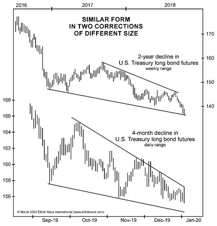
This figure … shows the correction in T-bond futures of 2016-2018 on a weekly chart against the correction in the last four months of 2019 on a daily chart. They look quite similar, and each one led to a run to new highs:
This figure…shows another example of the market’s adherence to forms. The top graph shows the 10-minute range for the S&P futures contract on March 4, and the bottom graph shows the same for March 5. Don’t they look similar?
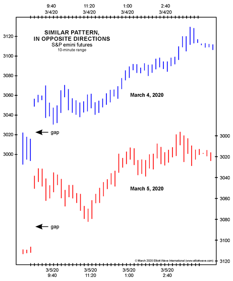
In fact, however, the trend of the market in the top graph was up, and the trend shown beneath it was down. We simply inverted the bottom graph for our illustration. Prices rose on March 4, and they fell on March 5, in the same pattern.
Here’s what this means for investors and traders: The fact that price charts unfold in repetitive and recognizable patterns makes financial markets probabilistically predictable.
Right now, we are letting subscribers know what fractal patterns are appearing in charts of stocks, bonds, gold, silver and the U.S. dollar.
Get ready for the next big price moves. Subscribe now to follow these insights in real time >>
Or, if you want to learn more about Elliott waves and the fractal nature of financial markets first, check out our Educational Resources >>